Salt is Not Just for Margaritas
Here's a little information about salt first:
1.The bigger the granule, the bigger the burst.
2.For it to really work well, the paint should be wet on the paper, but not shiny; semi-wet. Salt will just dissolve if the paper is too wet.
3.If you tilt the paper or lift it, the salt will run, and form a shooting star effect.
4.When the painting is dry, be sure to gently scrape off the re-crystallized salt.
5.Painting with salt will take longer to dry - but don't use a hair dryer.
6.You can apply salt in a second coat as long as it's a darker color. It's the pigment that makes it work; not the paper.
7.Let each space dry where salt was used before painting in adjoining areas.
8.I apply salt in different ways depending on what I want to accomplish; grain by grain, pinch by pinch, or spread generously.
Now, here's some uses and nice effects:
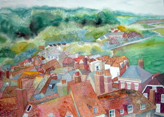
*Instead of painting every tile or shingle on a rooftop, try putting down the pigment in the space you want to cover, and add a little salt.
*Use salt to create a sense of snow. Popcorn salt and table salt work best. Other granules are too big.
*If you are trying to put bushes in the background, drop some salt along their top edge; it gives the feeling of fine branches.
*Salt along the edge of water on a beach gives the feeling of foam and breaking waves.
*Salt Used in a background can break up the monotony of a color, and contrast with the smooth spaces around it.
*Salt can break up a flat grassy area, or give a sense of roughness to a path or lane.
Try a Triad
We all love color, and the paint manufacturers sure fuel this passion! I've found that often, you can lose the mood if you put in too many colors (depending of course on your subject and mood!). Here are some interesting combinations to try. Notice that one of the primary colors is usually missing, and that I have substituted a related color instead (example: instead of using a blue, I use a green that leans to the cool (bluish) end of the spectrum. Most of my colors are Daniel Smith (www.danielsmith.com). I can't say enough about these paints, and this American manufacturer; great products, great service. Try these combos on a scrap of paper, and see if you don't get some great mixed colors, too! To help you out, I've listed the colors in columns representing red, yellow and blue:
RED YELLOW BLUE
Moonglow Olive Green Prussian Green
Perelyne Maroon Quinacridone Gold Undersea Green
Quinacridone Sienna Olive Green Prussian Green
Imperial Purple Lemon Yellow Manganese Blue
Moonglow Quinacridone Sienna Cobalt Blue
Quinacridone Rose Olive Green Moonglow
Often, I add a fourth color in the end for emphasis. I might need a dark, or a warm spot, or a neutral, but these combos are a great springboard to create a mood.
Build Your Painting Like Making a Bed
I often try to imagine how to best describe the process I go through to make a painting. Here's a good analogy - making a bed!
The actual bed frame is the concept and idea for your painting. The box spring is the sketching, color choosing, and design process.
Now the sheets and blankets; each layer of paint represents the making of the bed. Layers of covers, more or less depending on the painting.
Finally, the throw pillows - detail!
Viola! Your bed is made!